Clarofy Features: Heatmaps
Visualize three variables in a single graph with Clarofy's Heatmaps feature.
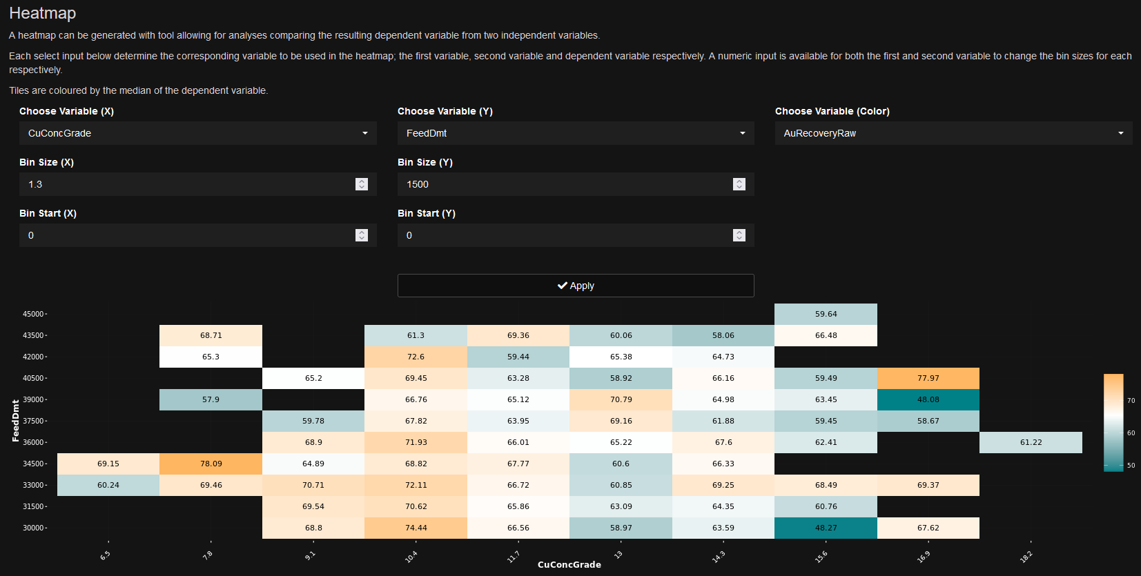
The Heatmap tool allows you to look at 3 variables on a single graph instead of the usual 2. The x and y variables are binned, and the 3rd variable (your KPI by default) is the colour. This is a great tool to find out what combination of values from 2 variables will result in an optimised KPI. For example; you might want to find the best combination of air and level to run your flotation cell for highest recovery.

Hope these tips help, and let us know what else you'd like to see in these articles!