Clarofy Features: Exploration
How to use the Exploration features to pick up relationships and trends in your data
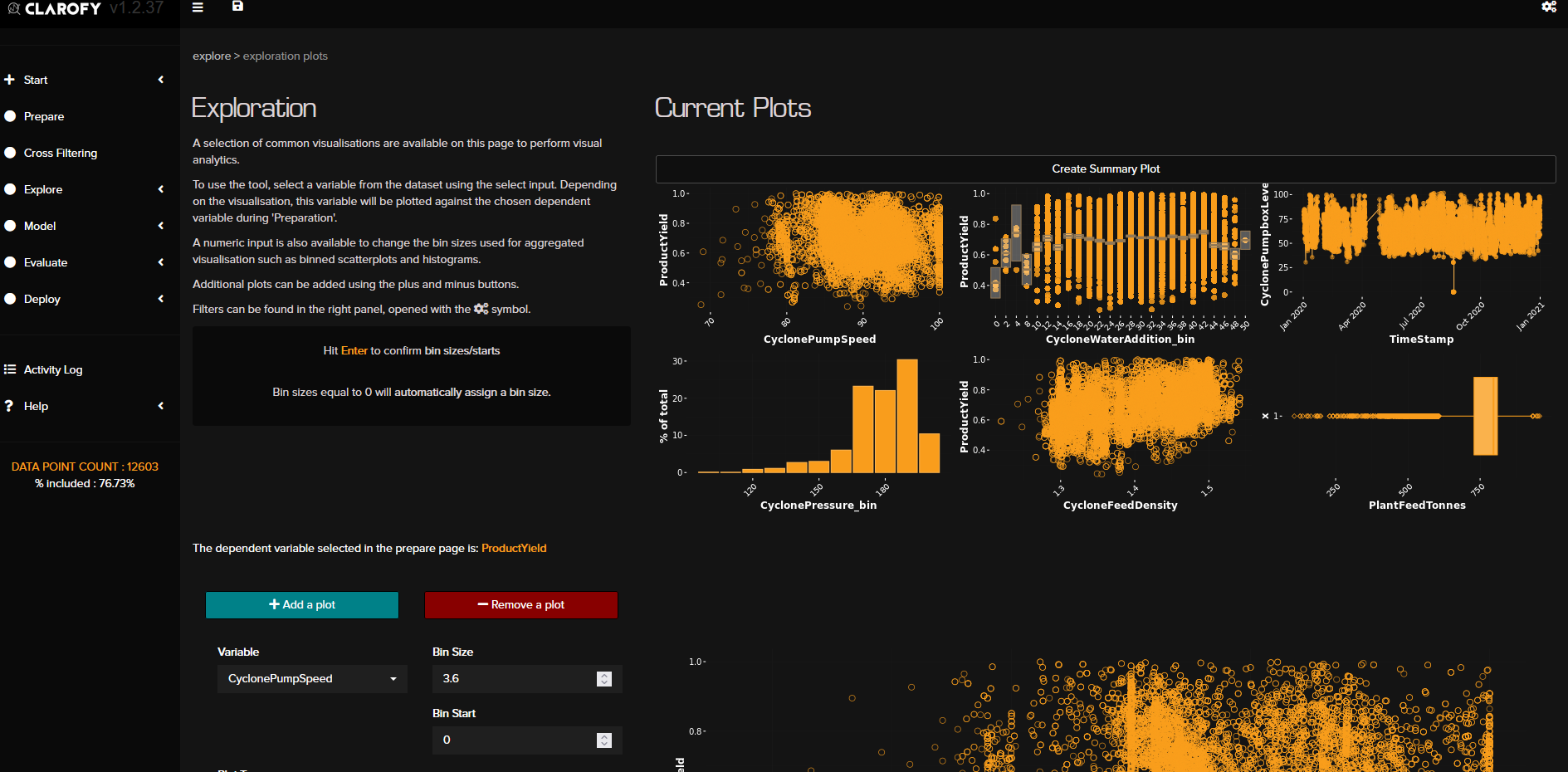
Exploration Plots: The Exploration Plots page allows you to investigate and discover trends, relationships, inflexion points and other intricacies in your data. You might conclude that you don’t have enough data for a decision. You might conclude that the trend you were after is either not seen in the data or obscured by other stronger trends and some Integration (removing the effect of a certain variable from a KPI) needs to happen.
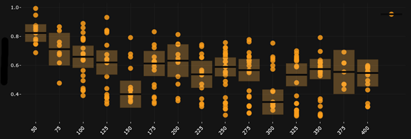
Use ‘Add a plot’ button to increase the number of graphs you can see. The default variable will be the first numeric column in your dataset. On each graph you can change the plot type, and if binned, the bin size and starting value. The value that is entered for ‘Bin Start’ does not filter the variable; however it means the first bin will have all the values up until the start value. The 'Create Summary Plot' button allows you to see all your plots in one place, like a dashboard and compare variables with each other.


Hope these tips help, and let us know what else you'd like to see in these articles!