Clarofy Features: Cumulative Sum
How to use monitor changes in your variable over time with Clarofy's CuSum feature
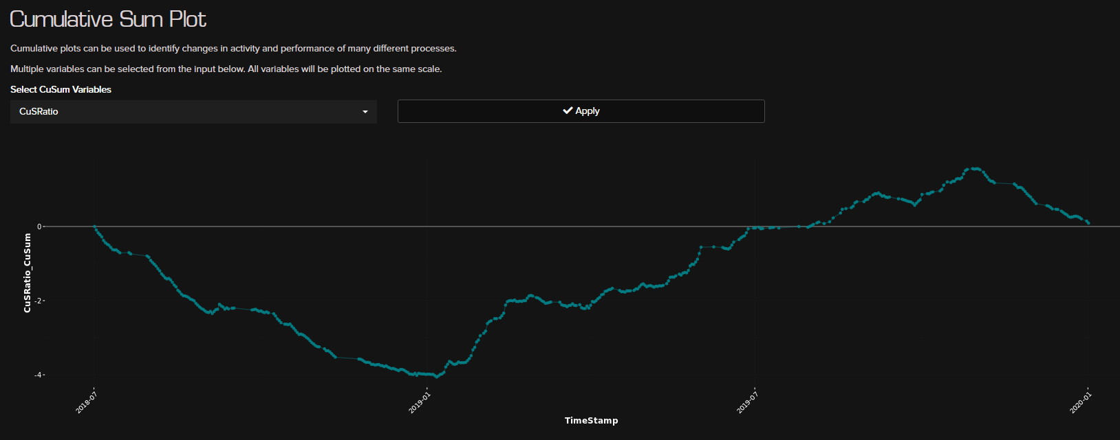
This is a control chart that allows you to monitor small shifts in the variable mean over time. A CuSum plot charts a statistic that incorporates current and previous data values from the process and the slope of the graph show the positive or negative change in the variable over time. In the example above, the variable has a negative slope until January 2019, after which it has a positive slope. This indicates a negative and positive 'deviation from target' which by default is zero - or no change in mean.
If your dataset in Clarofy does not have a timestamp variable, this graph will populate the x-axis with 'row number' instead.

Hope these tips help, and let us know what else you'd like to see in these articles!
Exploration
Exploration plots allow you to investigate and discover trends, relationships, inflexion points and other intricacies.