Clarofy Knowledge Base: Graph Types
What's the best graph to use for your purpose?
Exploration Graphs
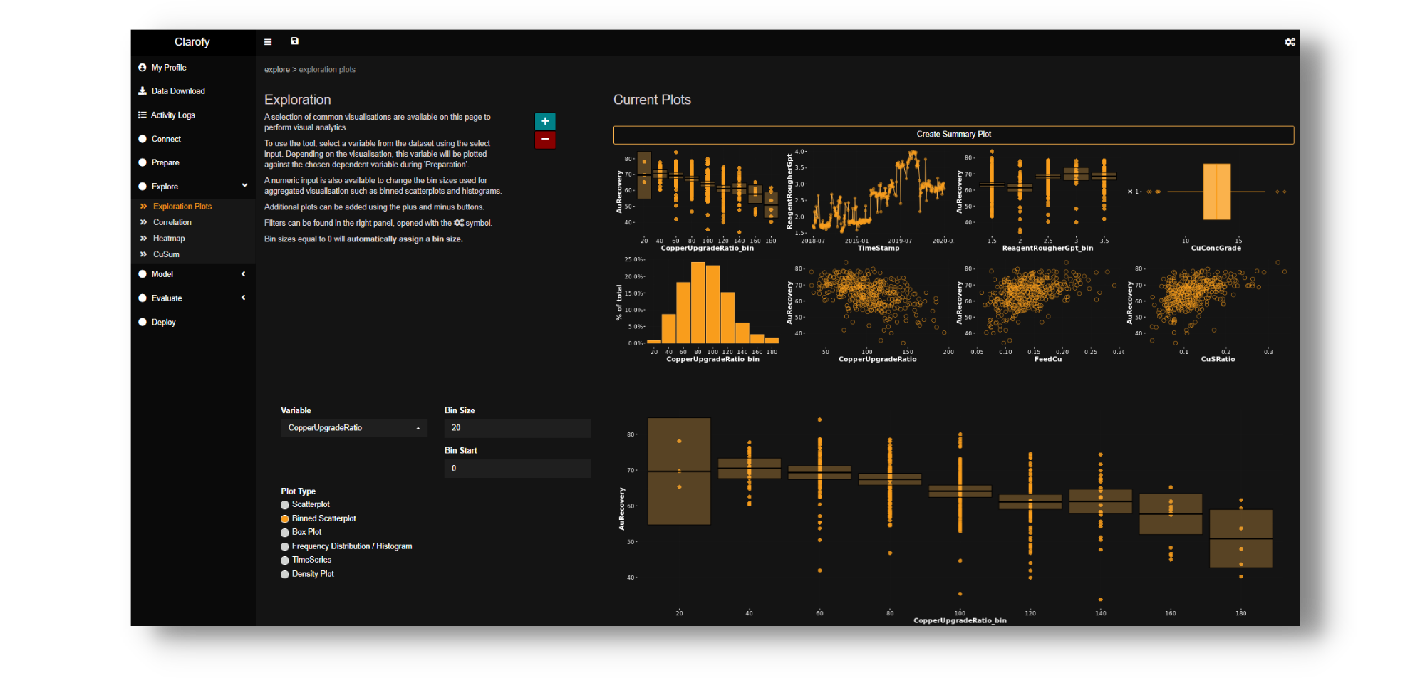
The following types of visualisations are predominantly used for exploration. At times with the right data transformations, they can also be used for evaluation. The exploration stage is the time to look at overall trends, such as potentially time sensitive relationships, commonly caused by, different geo-metallurgy ore bodies, or flow sheet changes. A good set of exploration graphs will ensure you are not drawing any conclusions or valuations on something that is an outlier or making any ‘ground-breaking’ discoveries such as “to improve recovery we need to increase the feed grade.”
.png?width=100&height=227&name=TYPES%20OF%20SHAPES%20%26%20DATA%20BLM%20(2).png)
Typical Shapes of Distributions in Data
Scatter Plots
Good For:
- Discovering and exploring relationships
- KPI vs Process Variables. e.g. throughput vs. P80; recovery vs. concentrate grade; metal tons vs collector dosage.
- Finding the strongest relationships in the plant such as feed grade vs recovery.
- Visualising relationships with only two or three relational factors. Such as throughput, P80 and power draw of major equipment.
Difficult With:
- Drawing actionable conclusions, calculating valuations, and finding best operating ranges.
- Very high-density data normally found when looking at minutely/secondly data or a few years of data
- Variables vs. setpoints as they can often stacked on top of each other.
- Discovering more subtle relationships in the plant (often over-shadowed by the strongest relationships).
- Multi-dimensional factors such as float recovery vs a combination of level, air, feed grade, con-grade etc.
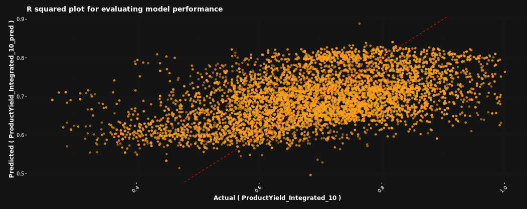
Tip: Often the presence of outliers can make a trend seem more prominent than it is, or may even give an incorrect trend. judicious filtering may be required.
Histograms
Good For:
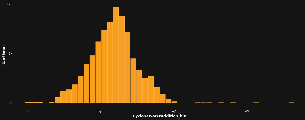
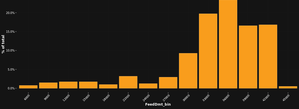
- Evaluating time spent at certain setpoints i.e. histograms of process variables can often indicate where previous setpoints or limits where.
- Identifying distributions within groups; are there bi-modal or even tri-modal distributions.
- Discovering where the data exist and where filters should be applied, which is useful when trimming tails or applying distributions.
Difficult With:
- Identifying relationships between two or more variables.
- Finding trends or changes over time
- Data aggregation must be consistent throughout. A change in aggregation from 1 minutely to 5 minutely, for example, can greatly skew your results.
Tips & Tricks:
- Histograms are invaluable when trying to figure out the typical range of set points in the plant, so they tend to be used as a first step to understanding a new area. Discovering the true variation in key KPIs through histograms is often surprising even to experienced team members.
- Viewing histograms over different categories within the variable being examined can yield useful results.
- An example of the above is to use histograms to show differences between time periods. This kind of result, however, should be used sparingly because scaling and other factors may distort interpretation. A time series may be used to explore and histograms to confirm.
- F-tests and T-Tests are great statistical tools to give numeric values to the differences in histogram distributions.
- F Tests give numeric value to the wideness of the distribution
- T Tests to give numeric value to the centre-point or average of the distribution.
- Histograms are very useful in collating information to inform your other visualisations in the following ways:
- The bin sizes for histograms inform a starting point for your binned scatter plots or box plots.
- A great rule of thumb for trimming tails is to filter out the end ranges of a histogram with counts less than 2% of the total.
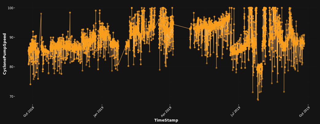
Time series
Good For:
- Looking for changes in variables over time.
- Ensuring that both long term and short-term trends are examined; looking at changes over the months or years, analysis related to control at a small time periods such as 24 or 48 hours.
- When stacked or related measures are used, you can find how relationships between variables have changed over time. – however sometimes this is more easily seen in scatter plots coloured by time.
- Identifying trials, modes or events in plant operation.
Difficult With:
- Finding relationships between variables.
- Noisy data that fluctuates heavily within a day or hour and could obscure valuable relationships.
- High data density as it exacerbates issues found in fluctuations.
Tips & Tricks:
- Aggregate the data when dealing with variables that fluctuate heavily, however be careful of introducing or removing relationships when aggregating
- Try different methods of aggregation, min, max, percentiles, average, moving averages.
- Be open to having a look at any available categorical variables over time, in addition to the numeric variables. Being critical of an operation mode may be unfair if 90% of its data occurred before a particular upgrade or with a certain ore type.
- Spend some time looking at some time series if you are unfamiliar with the plant. It gives important contextual information as to the stability of the plant, how often shutdowns occur, when different modes in the plant are in operation.
- After transforming data (such as integrating feed grade out of recovery, or modelling a dependent variable) compare it again on a timescale to see if there are errors or different correlations with time.
Evaluation Visuals
Evaluations can sometimes be an unclear way to form conclusions because we will come across a correlation that may not imply a causation. The following visualisations however, are about getting closer to a decision; or even getting to the right direction to complete a trial and come to a conclusion. In most situations, finding a second or third piece of evidence that informs the hypothesis can be valuable. Hopefully through exploration you have found out which variables you need to model out the effect of, decided which areas to exclude, and what the sensitivities might be when you draw a conclusion.
Binned scatter
Good For:
- Identifying trends clearly across the data: A summary statistic (such as the mean or median) overlaid on each bin with confidence intervals allows easy visualisation of any patterns. It also clears up a lot of the noise that is often present in high density data. T-tests can be then used to quantify the average differences.
- Overlaying with Box and Whisker plots in order to visualise how the distribution of data changes throughout the population ranges. F-tests can be then used to quantify the distributions differences.
- Determining which ranges of processing variables give the best results in comparison to a KPI. Once this has been done, a T-test can be used to find out if the difference between the selected ranges will result in a statistically better KPI.
- A relationship with size is less clear, but we can see that an increasing particle size is detrimental to recovery. With more data, a range of optimum particle size can be selected.
- If looking for multi-variable interactions in order to discover how ranges interact across difference process variables, make sure ‘cherry-picking’ of certain modes or time periods isn’t occurring.
- Finding out which control loops need tuning: A great way to do this is to look at a certain variable setpoint (an SP or SV tag) against the corresponding error (difference between the actual value (PV) and the setpoint (SV)). It allows you to determine if the error changes at different SV ranges.
- Data reveals its non-linear maximums (if present) when using the correct binning size. This might be trickier to discover using scatter plots alone. This is also a good reason to try different bin sizes before confirming any hypotheses.
- If your data has low density (perhaps once a day or shift), trends may be difficult to uncover with binned scatter plots.
- Binned scatters do not visualise the amount of time or the amount of data points in each process variable.
- Unable to see different categories or modes of operation – view these on separate binned scatters.
Tips & Tricks:
- Modelling out and integrating your overriding factors is key in extracting meaningful results.
- Experiment with bin sizes, you may find that your bins are too big or too small.
- Use T-tests to confirm your conclusions.
- Use a heatmap or colour your points by a third variable to explore how correlations may be affecting your data.
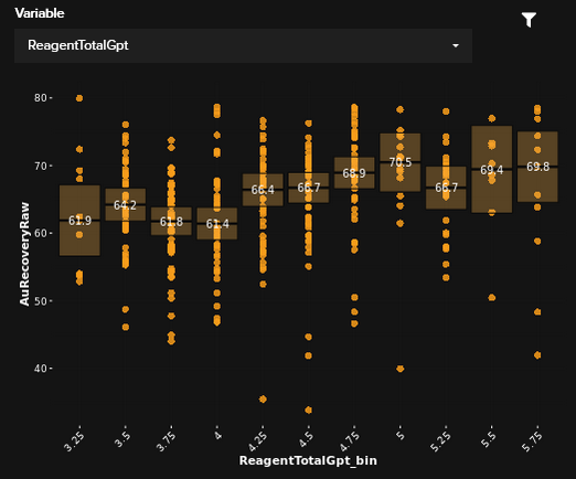
The Binned Scatter graph below shows a clear trend, and potentially even an inflection point.
Good For:
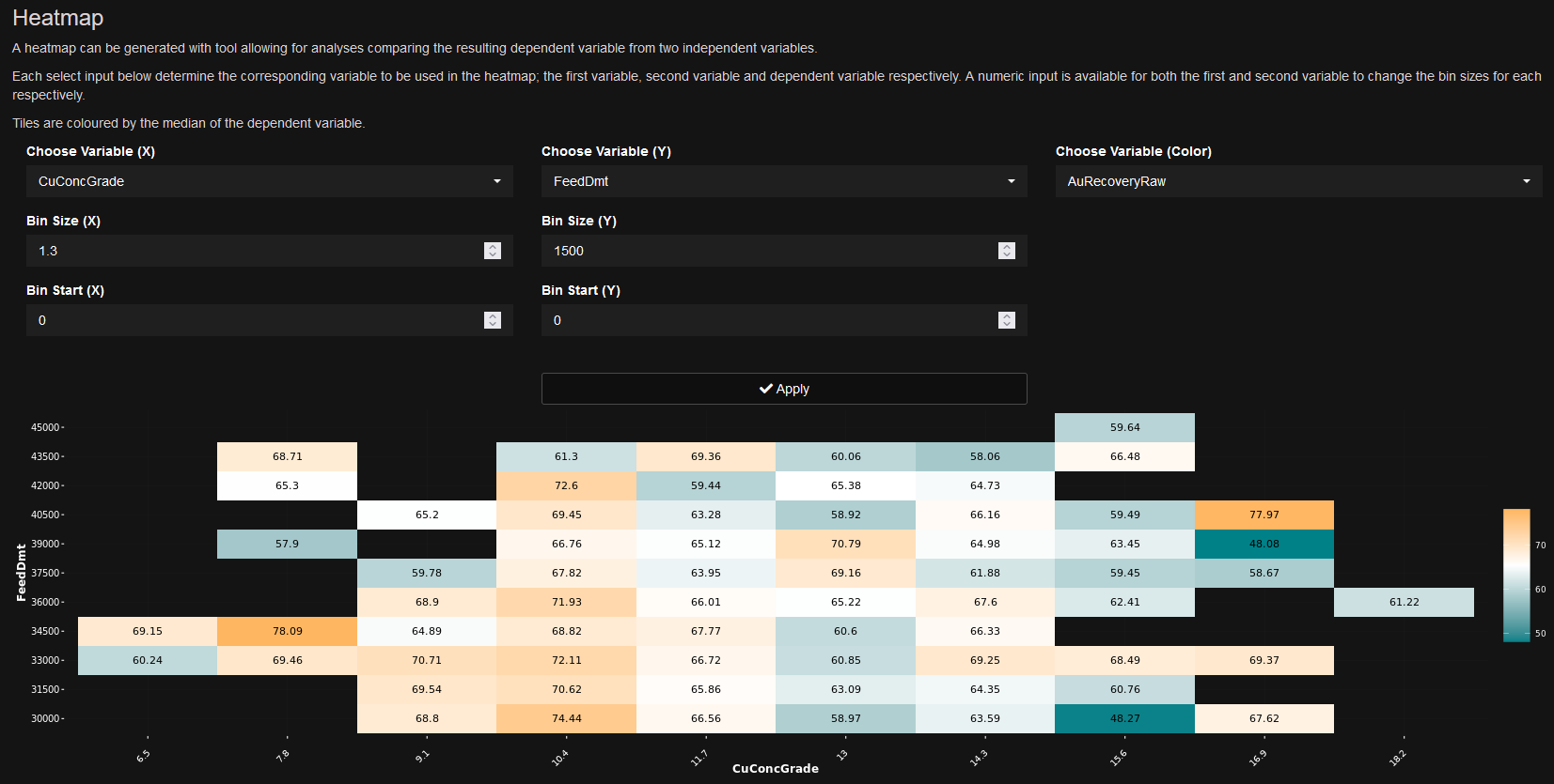
- Evaluating performance over three or more dimensions
- Using the averages in each of the bins you can evaluation changes in KPI’s over the surface of the solutions space
Difficult With:
- Low density data
- Noisy data
Tips & Tricks:
- Experimenting with bin sizes is a must.
- Great for displaying simulated data to allow users to explore scenarios
- Ensure the colour chosen is of a good range, often the minimums and maximums and event divergent point if using a double colour scale can give a false impression of the responsiveness of the data
Explore your data
Visualise your data so you can see overarching trends.
Analyse your data
Let's test relationships and measure their significance.