Clarofy Knowledge Base: Explore your data
So many graph types - which is the most useful?
This stage is primarily about visualising your data so you can see overarching trends and pick up any areas of interest within Clarofy's toolset. We actually use visualisation in nearly every stage of the data science workflow, it is the most versatile of tools.
Keep in mind that Prepare, Explore and Analyse phases are often interlinked and we tend to move back and forth through them many times in a typical workflow.

Here are some things to think about during this stage:
Data Visualisation helps us to:
- Understand and contextualise our data
- Find patterns, relationships and insights
- Explore possible answers for our hypothesis
- Helps identify overwhelming relationships
Some types of visualisations lend themselves better to one use over the other and, making the decision of which to use in each application something that any Data Scientist or Analyst will learn.

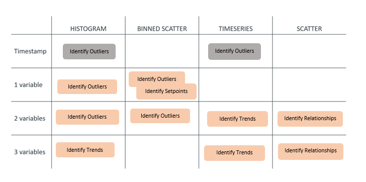
Above is a ‘cheat sheet’ you can use to understand which plot type you could use for a certain application.
It’s easy to get caught up when diving into the data; go back to your initial hypothesis so that you will create visualisations with purpose. Remember to document your exploration process and findings as you go and remember that the number of visualisations can grow quickly!
Dealing with overwhelming relationships
How do we tell if an process change resulted in improvement if the feed grade changed as well?
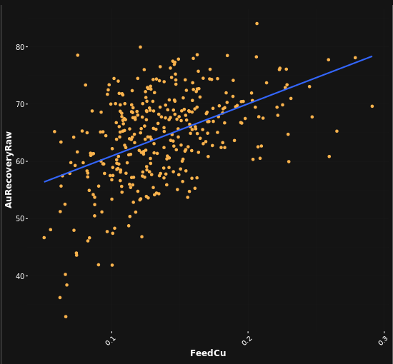
Feed Grade (and other overwhelming variables) can mask the effect of process changes. This is illustrated in the graph above, which shows feed quality against recovery in a plant.
The strong relationship makes it difficult to ascertain if other process changes have had an effect on the KPI.
You can deal with an overwhelming relationship in a number of ways:
- Try using a Binned Scatter plot to show changes in bin medians
- A Pearson's Correlation value for the variables in question would give an indication of the effect of one on the other
- Integration, or removing the effect of an overwhelming relationship: this can be done in the Integration feature in Clarofy
- Multiple linear regression

Clarofy's intergration feature is shown below:
.png)
Hope these tips help, and let us know what else you'd like to see in these articles!
Prepare your data
Before exploring data, it's essential for your data to be cleaned and manipulated.
Analyse your data
Once you have some understanding of your data through exploration, you are in the position to test the relationships you see.